Brief:
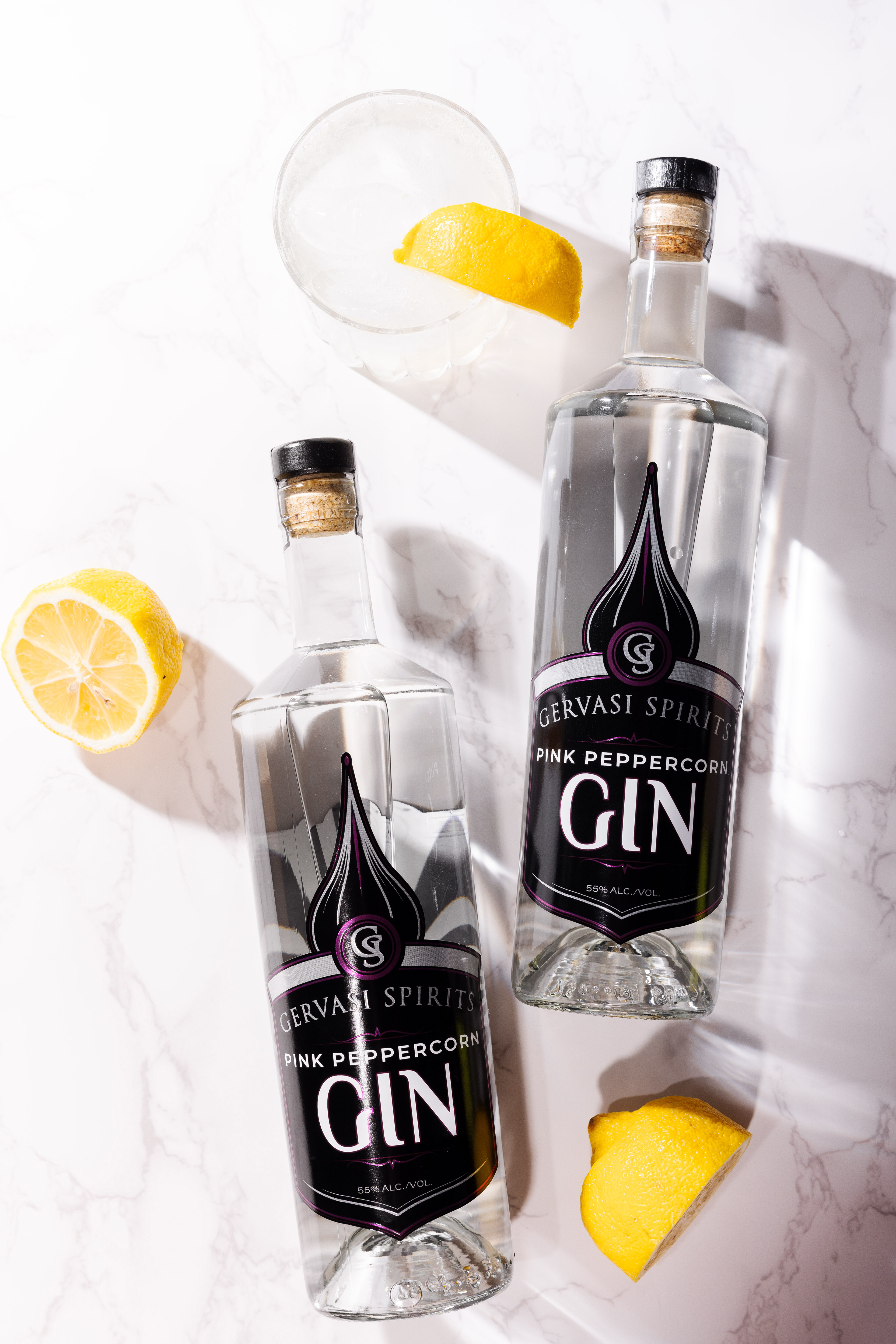
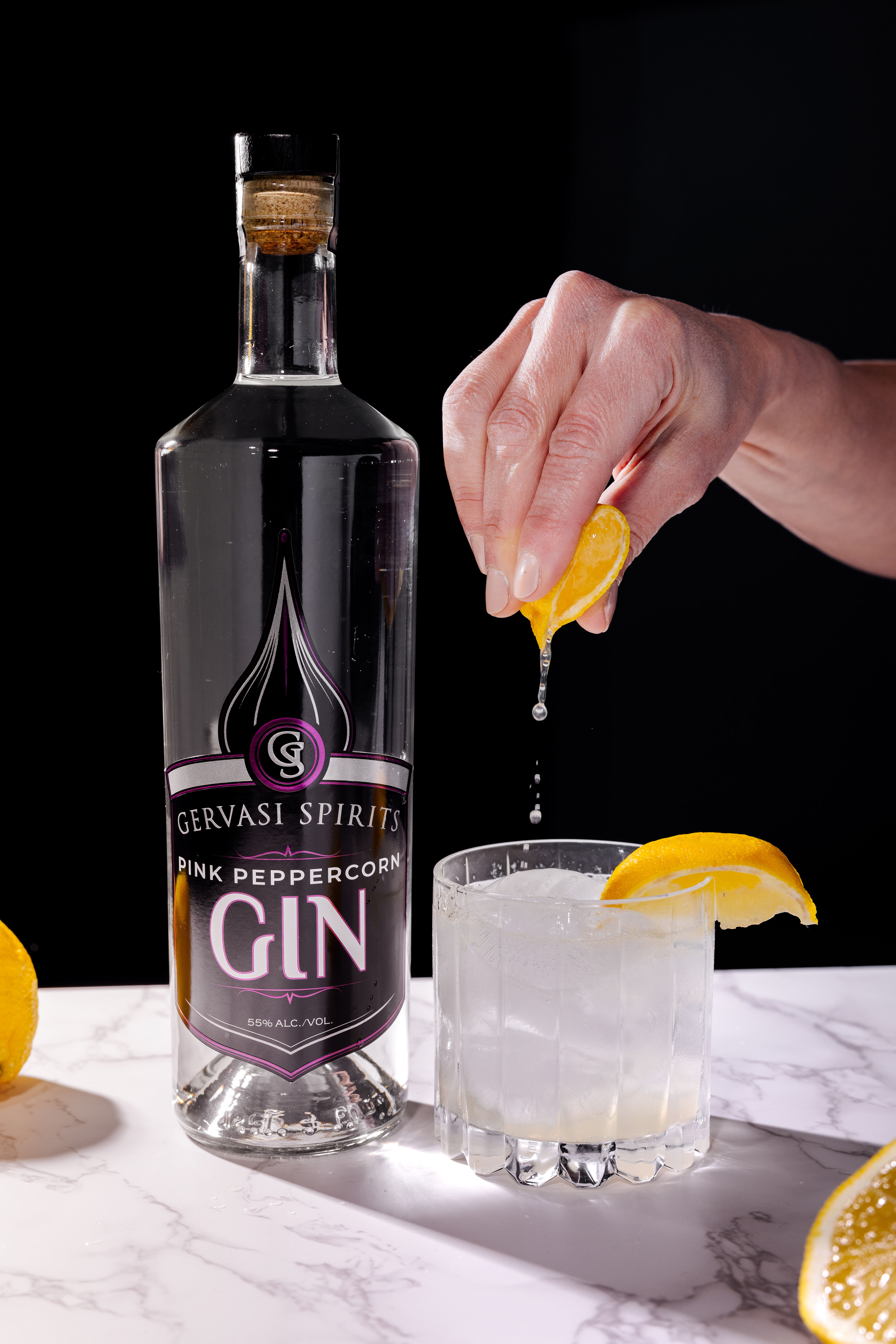
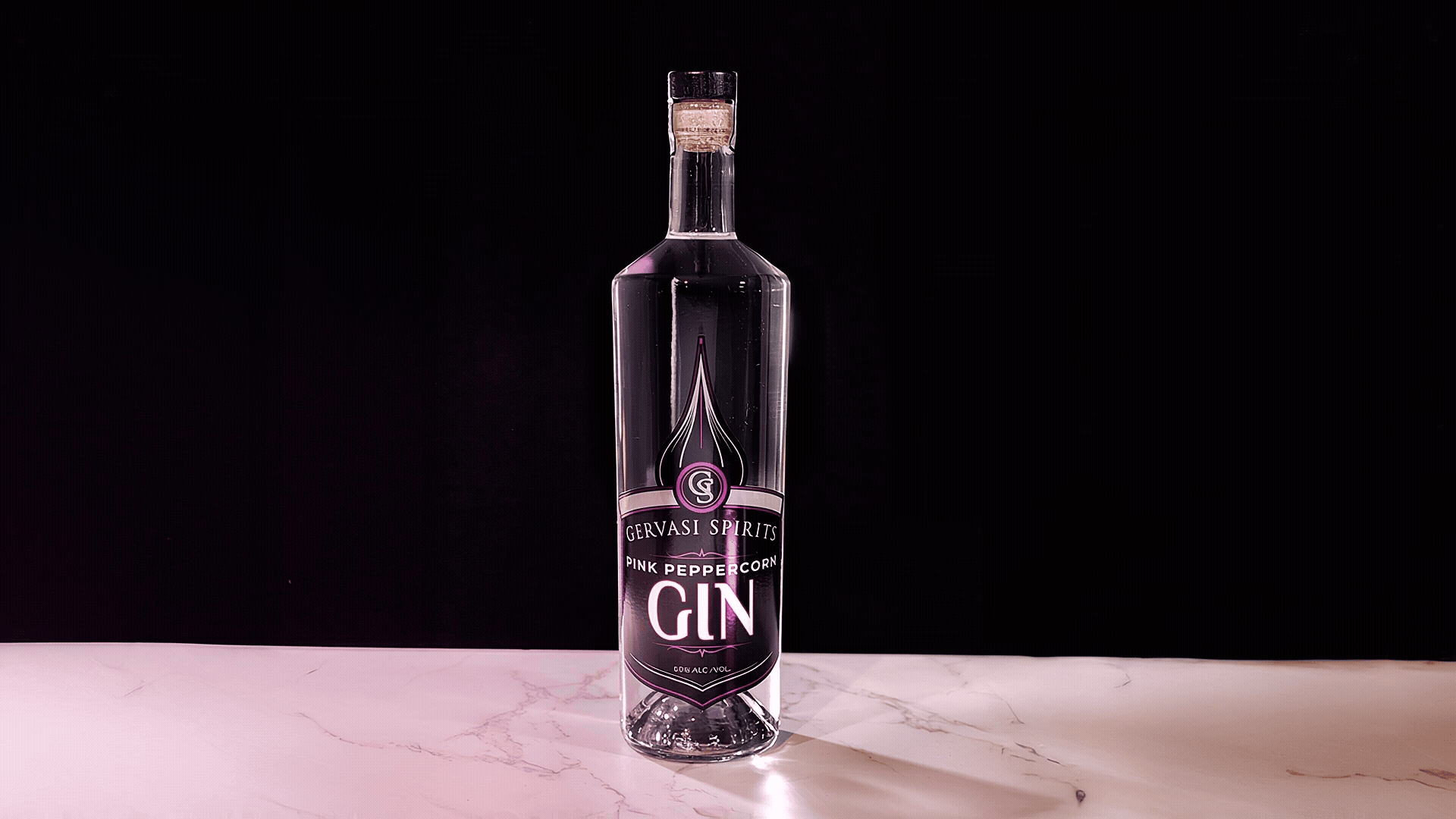
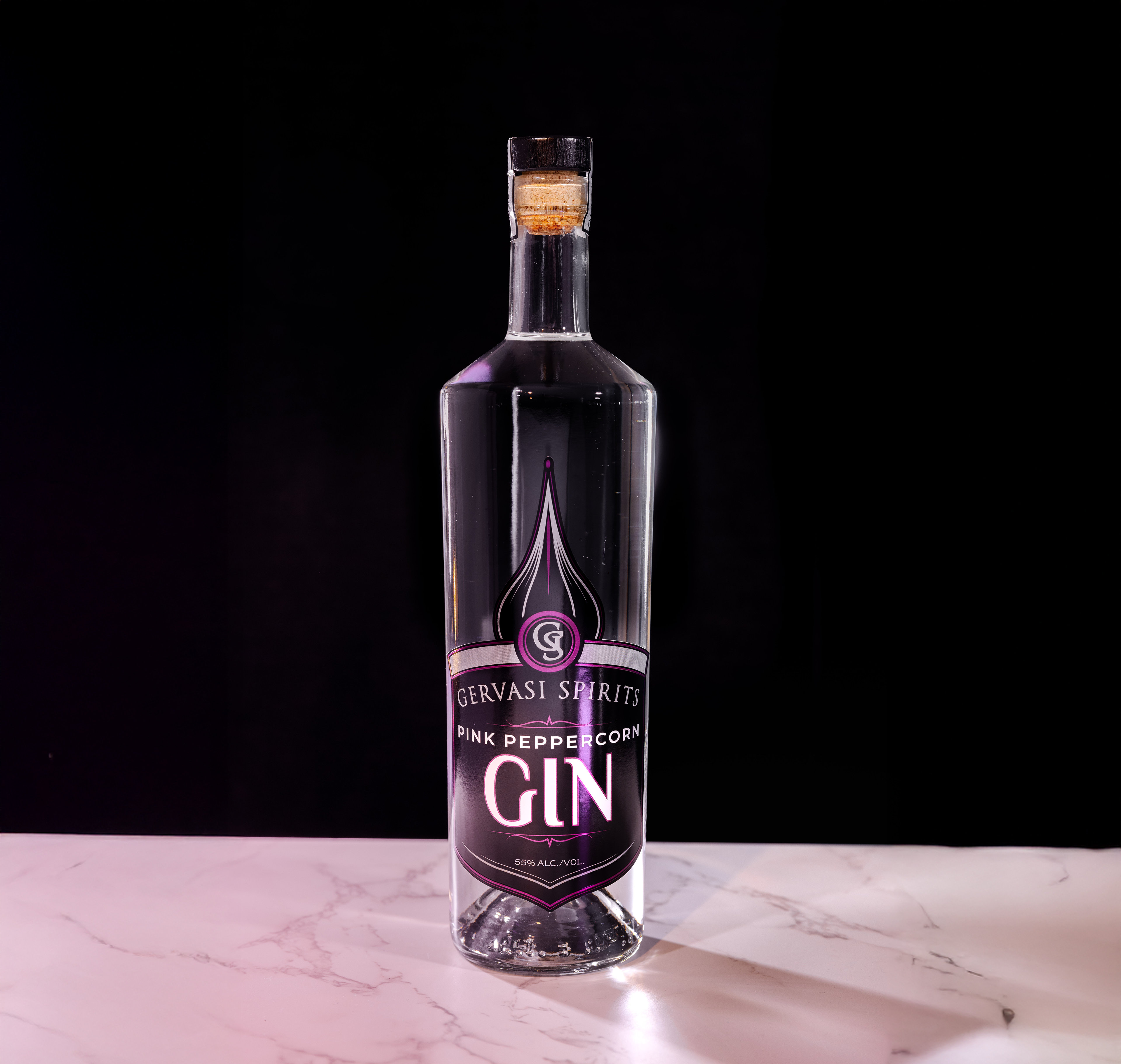
Designed the label for Pink Peppercorn Gin, the inaugural product in the resort’s new Distiller’s Series—an exclusive line of spirits crafted to highlight unique ingredients and small-batch production. The label needed to align closely with the existing spirits collection while introducing a distinctive design cue to mark the series's special status.
Designed the label for Pink Peppercorn Gin, the inaugural product in the resort’s new Distiller’s Series—an exclusive line of spirits crafted to highlight unique ingredients and small-batch production. The label needed to align closely with the existing spirits collection while introducing a distinctive design cue to mark the series's special status.
Photo Credit:
Mal McCrea
Goals:
Maintain visual continuity with the established spirits brand to ensure shelf cohesion.
Introduce a new design element to clearly differentiate the Distiller’s Series—establishing a foundation for future products in the line.
Recommend and implement a two-toned foil treatment to create visual depth and subtly signal the product’s elevated, limited-edition nature.
Ensure the final design balances refinement with boldness, reflecting both the premium nature of the product and the creativity behind the series.
Set a replicable visual standard for future Distiller’s Series releases.
What I Learned:
This project taught me the value of restraint in design evolution—how small, intentional changes like foil color variation can effectively introduce a new product line without disrupting overall brand cohesion. It also emphasized the importance of thinking ahead: by setting a clear design precedent with this first release, we established a scalable framework that will guide the look and feel of future Distiller’s Series offerings.
This project taught me the value of restraint in design evolution—how small, intentional changes like foil color variation can effectively introduce a new product line without disrupting overall brand cohesion. It also emphasized the importance of thinking ahead: by setting a clear design precedent with this first release, we established a scalable framework that will guide the look and feel of future Distiller’s Series offerings.