Brief:
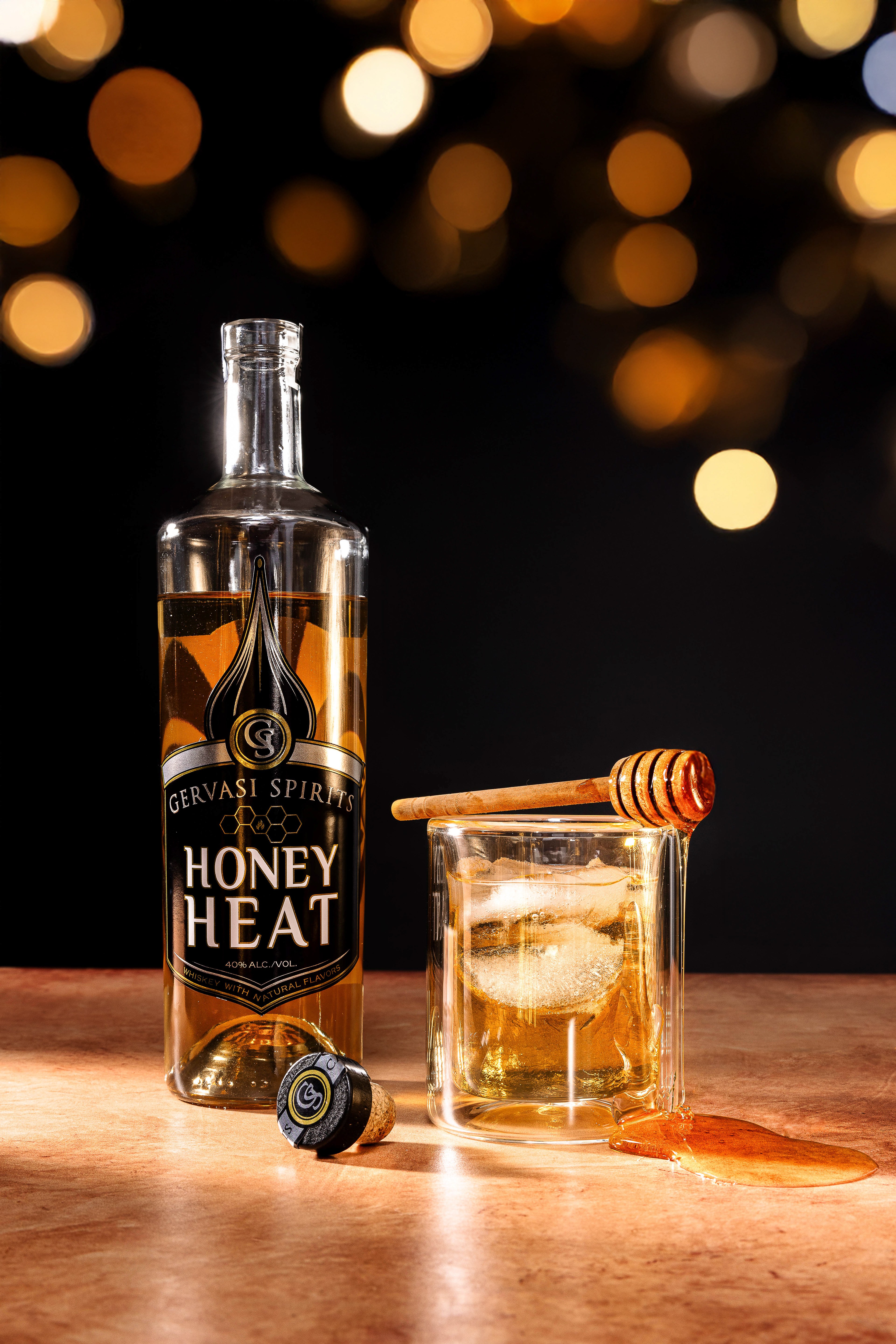
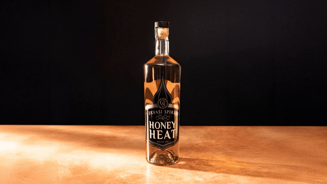
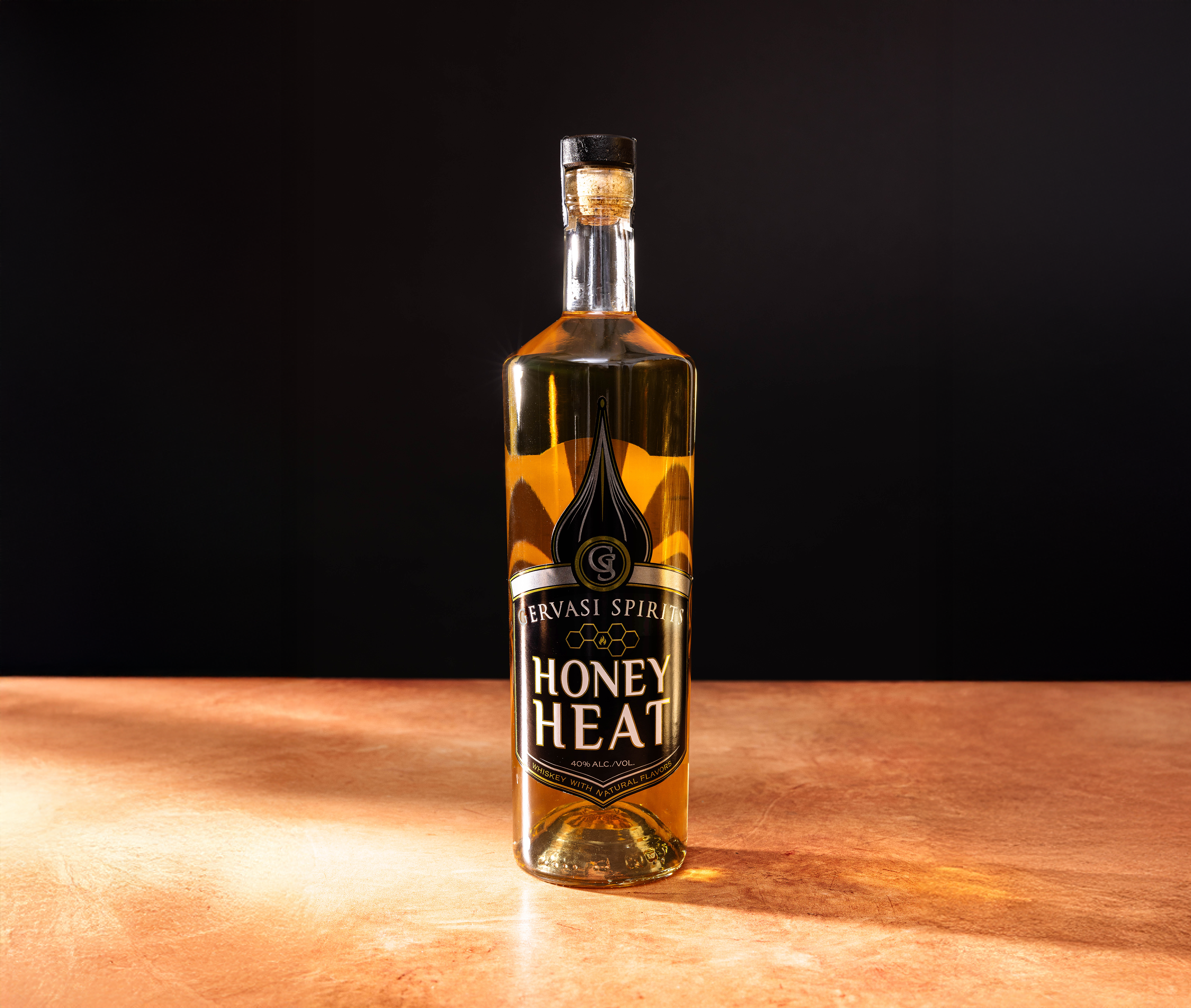
Designed the label for Honey Heat Whiskey, a seasonal, limited-edition spirit combining honey sweetness with a spicy finish. The goal was to maintain strong visual ties to the existing spirits line while adding distinct touches that highlighted the unique flavor profile and seasonal nature of the product.
Designed the label for Honey Heat Whiskey, a seasonal, limited-edition spirit combining honey sweetness with a spicy finish. The goal was to maintain strong visual ties to the existing spirits line while adding distinct touches that highlighted the unique flavor profile and seasonal nature of the product.
Photo Credit:
Mal McCrea

Goals:
Create a label that fits seamlessly within the established spirits brand but stands out subtly as a limited-edition offering.
Introduce small but impactful design elements—specifically, honeycomb and fire symbols—to visually communicate the product’s honey and heat characteristics.
Ensure the design retains a sophisticated, cohesive look that aligns with the brand’s premium positioning.
Keep production considerations efficient by making minimal adjustments to the standard label layout, allowing for smooth integration into the existing workflow.
What I Learned:
This project reinforced the effectiveness of precision detailing in design—how even modest visual tweaks, when thoughtfully applied, can convey a product’s unique attributes without disrupting overall brand consistency. It also highlighted the value of strategic restraint, balancing creativity with operational efficiency for limited-run products.
This project reinforced the effectiveness of precision detailing in design—how even modest visual tweaks, when thoughtfully applied, can convey a product’s unique attributes without disrupting overall brand consistency. It also highlighted the value of strategic restraint, balancing creativity with operational efficiency for limited-run products.